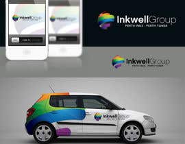
Logo Design for Inkwell Group - Perth Inks - Perth Toner
- Status: Closed
- Prize: $490
- Entries Received: 51
- Winner: maidenbrands

Contest Brief
We are an online ink and toner store
Recommended Skills
Employer Feedback
“@maidenbrands won the contest on 11 July 2012”
![]() gsn808, Australia.
gsn808, Australia.
Public Clarification Board
-

CristianLuca
- 11 years ago
Congratulations maindenbrands,
I have a questions for your guys. How do you, maidenbrands, timedsgn, patrickpamittan made those logo presentations, is that a template? Did you modified in 3DSMax or something like that?
Thank You- 11 years ago
-

jazzbigbox
- 11 years ago
yap, these templates called logo mockups. you can find these at graphic river
- 11 years ago
-
CristianLuca
- 11 years ago
Thank you!
- 11 years ago
-

PPG9773
- 11 years ago
Congrats to the winner :).
- 11 years ago
-

digitalmx
- 11 years ago
please rate my designs. 10x
- 11 years ago
-

BossGraphics
- 11 years ago
Please do check #390,391 and let me know you're feedback about it.
- 11 years ago
-

Foysallancer
- 11 years ago
Please give me feedback or rating
- 11 years ago
-

sergiovc
- 11 years ago
#404 feedback please, thanks.
- 11 years ago
-

dimitarstoykov
- 11 years ago
#393 Thanks.
- 11 years ago
-
dimitarstoykov
- 11 years ago
and #394
- 11 years ago
-

lakekover
- 11 years ago
Please check and rate my designs #385 , #386 and #384 . Thanks so much for the opportunity! :)
- 11 years ago
-
digitalmx
- 11 years ago
#354 please feedback
- 11 years ago
View 2 more messages
-

krustyo
- 11 years ago
Please check and feedback #375
- 11 years ago
-

jdrusev
- 11 years ago
Hi please check #368 #303 #367
- 11 years ago
-

mURITO
- 11 years ago
Pleas #279
- 11 years ago
-

darsash
- 11 years ago
Hey! also #344
- 11 years ago
-
darsash
- 11 years ago
Hi pleas check my entry: #340 thankyou
- 11 years ago
-
PPG9773
- 11 years ago
I note that in your brief you refer to The Inkwell Group - capital T on The - leading me to understand that it is part of the name. Can you please clarify - thanks! Oh and please feedback/reject/rank #256 - TA!
- 11 years ago
-

Contest Holder - 11 years ago
"the" is optional.
- 11 years ago
-
PPG9773
- 11 years ago
Thank you...
- 11 years ago
-

vjkatashi
- 11 years ago
Check out my new designs...
- 11 years ago
-
Foysallancer
- 11 years ago
Please take a look at my designs,thanks
- 11 years ago
-
jdrusev
- 11 years ago
Please check #295 Thanks!
- 11 years ago
-
jdrusev
- 11 years ago
and #303
- 11 years ago
-

patrickpamittan
- 11 years ago
Please review my entry #287
best regards!
Patrick- 11 years ago
-
Contest Holder - 11 years ago
Just some inspiration as I see some of the colours are quite flat, I like depth in the colours here is what I mean http://fc09.deviantart.net/fs15/i/2007/044/c/0/Spectrum_by_XiceGfx.jpg and http://hoaglundandsons.com/storage/cd2011.png?__SQUARESPACE_CACHEVERSION=1304055030097
- 11 years ago
-
jazzbigbox
- 11 years ago
open google and search "Spectrum_by_XiceGfx" ONLY open deviantart link
- 11 years ago
-
PPG9773
- 11 years ago
Thank you jazz!
- 11 years ago
-

suhas02
- 11 years ago
plz check #252,
- 11 years ago
-
Contest Holder - 11 years ago
#239 and #240 are a perfect example of what I mean by depth in the colours, more entries like this please
- 11 years ago
-
UltraLogoDesigns
- 11 years ago
Could you check please #242 :) Hope you like it :) Thanks
- 11 years ago
-

exoticart
- 11 years ago
Could you please resend the link.
- 11 years ago
-
Contest Holder - 11 years ago
http://fc09.deviantart.net/fs15/i/2007/044/c/0/Spectrum_by_XiceGfx.jpg
- 11 years ago
-
exoticart
- 11 years ago
Thanks
- 11 years ago
-
Contest Holder - 11 years ago
I like the spectrum look of #150 please submit more like this :)
- 11 years ago
-
CristianLuca
- 11 years ago
Perth Inks, Perth Toner, The Inkwell Group don't exist on the internet. Please provide links.
- 11 years ago
-
Contest Holder - 11 years ago
this is a new business
- 11 years ago
-

msfordesigns
- 11 years ago
Please check and review #205 and #206. Thank you
- 11 years ago
-
suhas02
- 11 years ago
plz check #191
- 11 years ago
-
PPG9773
- 11 years ago
If you can spare the time to rank/reject/give feedback it would be most appreciated - design #136
- 11 years ago
-
PPG9773
- 11 years ago
Thank you
- 11 years ago
-

shayshay92
- 11 years ago
#170
- 11 years ago
-
vjkatashi
- 11 years ago
Click me and check out my all logos.
- 11 years ago
-

DaTuck
- 11 years ago
I just uploaded #162. I am willing to make additions and/or changes. Thanks.
- 11 years ago
-
DaTuck
- 11 years ago
Also #167. Thank you.
- 11 years ago
-

tanuja226
- 11 years ago
#150 , Thank You.
- 11 years ago
-
Contest Holder - 11 years ago
on #123 i think the symbol is too big compared to the text
- 11 years ago
-
Contest Holder - 11 years ago
please dont get fixed on an ink drop symbol, it can be just something symbolising colour coming together, I am open to all good ideas please be original
- 11 years ago
How to get started with contests
-

Post Your Contest Quick and easy
-

Get Tons of Entries From around the world
-

Award the best entry Download the files - Easy!