Design a Logo for My RICH Life

  • Status: Closed
  • Prize: $30
  • Entries Received: 103
  • Winner: SaifulSk

Contest Brief

Looking for logo design for new company.
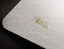
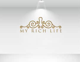
Logo to be in gold.

Logo must have a vine in it. I like the attached picture of the vine. Logo needs to be simple--classic-looking--and able to be embossed (so solid, not detail lines).

Also like the idea of a heart (see attached picture, I like the 2 on the left), but cannot be an obvious heart. Needs to be gender neutral--can be for either man or woman. Don't HAVE to have a heart in the design.

Company name is My RICH Life.

RICH stands for Ridiculously Impressive Chaos Handling.

Show me what you can come up with!

Company is focused on educating and providing tools to people for time management, so they can live better, happier, more fulfilled lives.

Recommended Skills

Employer Feedback

“He was very accommodating to changes I wanted made to his great original design. He even read my mind when I didn't clarify a revision enough! Great to work with; very talented. Thank you! SUPER pleased!”

Profile image mipllc, United States.

Top entries from this contest

View More Entries

Public Clarification Board

  • GRrasel05
    GRrasel05
    • 5 years ago

    Check #117 #118

    • 5 years ago
  • GRrasel05
    GRrasel05
    • 5 years ago

    Check #117 #118

    • 5 years ago
  • GRrasel05
    GRrasel05
    • 5 years ago

    Check #117 #118

    • 5 years ago
  • luisarmandojeda
    luisarmandojeda
    • 5 years ago

    Check #110

    • 5 years ago
  • GRrasel05
    GRrasel05
    • 5 years ago

    Check #117 #118

    • 5 years ago
  • shivnp
    shivnp
    • 5 years ago

    please checl #112 and #113 please

    • 5 years ago
  • ahamediqbal1650
    ahamediqbal1650
    • 5 years ago

    check #109

    • 5 years ago
  • rogrox
    rogrox
    • 5 years ago

    # 107

    • 5 years ago
  • SaifulSk
    SaifulSk
    • 5 years ago

    plz check #106

    • 5 years ago
  • mipllc
    Contest Holder
    • 5 years ago

    Ok, one last try. I want the wording inside a time graphic (so inside the watch/clock face, or whatever graphic). Presumably this will make the logo round. Incorporate a SIMPLE vine in somehow, whether within the circle, part of the letters/words, or part of the time graphic.

    Remember, simple is classic and classic is always in style.

    • 5 years ago
  • ahamediqbal1650
    ahamediqbal1650
    • 5 years ago

    Please check #64 , #65 .

    • 5 years ago
  • GRrasel05
    GRrasel05
    • 5 years ago

    Check #62 #63

    • 5 years ago
  • mipllc
    Contest Holder
    • 5 years ago

    Because RICH stands for Ridiculously Impressive Chaos Handling, the graphic or font could reflect an aspect of chaos, time management, organizing time.... I won't require the vine, even though I still like the idea very much. You guys are giving me some great stuff, we just haven't got there quite yet. Keep it coming!

    • 5 years ago
  • mipllc
    Contest Holder
    • 5 years ago

    #51 I really like, but it doesn't work--I'm female and so like it, but think it is too feminine to work for the company--too frail and frilly. I like the box around the name. Please add a time aspect, and incorporate the vine into the box (one line of the box be the vine?).

    • 5 years ago
  • mipllc
    Contest Holder
    • 5 years ago

    #40 and #45 - same design on different sample.....

    Make the y and ife in small letters. Show me this in different fonts.....and add a time aspect to it (something to show it is a time management company).

    • 5 years ago
  • mipllc
    Contest Holder
    • 5 years ago

    It has been brought to my attention that there is going to be a misconception about the RICH part, unless I put a clarifier in--something that shows right off the bat what the company is about. So, please incorporate a clock face or something to designate that the company centers on time management. Clock face is the only thing I can come up with at the moment, but that's why I have you guys' creative minds on this project!!!

    • 5 years ago
  • ahamediqbal1650
    ahamediqbal1650
    • 5 years ago

    Sir, check another design #47 , #48 , #49 , #50 , #51 .

    • 5 years ago
  • GRrasel05
    GRrasel05
    • 5 years ago

    Check #40 #41 #42 #43 #44 #45

    • 5 years ago
  • mipllc
    Contest Holder
    • 5 years ago

    #29, I like....but I don't. I don't know how to change it where I would like it more. But I don't like the top and bottom together. And I don't like those components together. I think the straight line V graphic on the bottom is a total "no" for me. Maybe invert the vine and move it to the bottom? Give me some more options.

    • 5 years ago
  • mipllc
    Contest Holder
    • 5 years ago

    #37 and #36 : I like the idea of the circle. But I don't like the white text. Could you inverse it? So that the text is gold and the circle is an outline. I like that this one is different!

    • 5 years ago
  • mipllc
    Contest Holder
    • 5 years ago

    #39 and #38 , same comments as #32 : I like the simplicity. I want RICH to be in all capitals, but the My and Life to only have the first letter capitalized. Is there a way to make the circle a simple (barely anything) vine? And I would like to see different fonts.

    • 5 years ago
  • mipllc
    Contest Holder
    • 5 years ago

    #21 - I like the elegance...but is a little too much curl for me. Don't want it so....flimsy or curly.

    • 5 years ago
  • mipllc
    Contest Holder
    • 5 years ago

    #30 , I would like to see different fonts. I love how striking this one is!

    • 5 years ago
  • mipllc
    Contest Holder
    • 5 years ago

    #32 , I like the simplicity. I want RICH to be in all capitals, but the My and Life to only have the first letter capitalized. Is there a way to make the circle a simple (barely anything) vine? And I would like to see different fonts.

    • 5 years ago
  • mk45820493
    mk45820493
    • 5 years ago

    sir please check #30

    • 5 years ago
  • mipllc
    Contest Holder
    • 5 years ago

    Need to have RICH stand out from My Life. I like the text with the vine intertwined, like #5 .

    • 5 years ago
    1. soohilaa
      soohilaa
      • 5 years ago

      THANKS, any changes you like ,feel free to tell

      • 5 years ago
  • GRrasel05
    GRrasel05
    • 5 years ago

    Check #2 #3 #6 #7

    • 5 years ago
    1. mipllc
      Contest Holder
      • 5 years ago

      Too curly and too complicated. Maybe simplify and make more bold?

      • 5 years ago
  • mipllc
    Contest Holder
    • 5 years ago

    Vine, not curly, but no leaves, birds, or other things. SIMPLE is super-important. Elegant, but SIMPLE. #9 , #5 , and #21 are closest.

    • 5 years ago

Show more comments

How to get started with contests

  • Post your contest

    Post Your Contest Quick and easy

  • Get tons of entries

    Get Tons of Entries From around the world

  • Award the best entry

    Award the best entry Download the files - Easy!

Post a Contest Now or Join us Today!