Freelancer: naty2138
Share:
Report Entry

Face painter 2

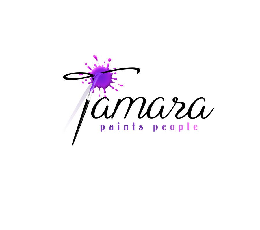
Hi Tamara, as you wish, I've made some changes - color scheme, font for "paints people", and spacing. Is this closer to your needs?
Contest Entry #282 for                                                 Design a Logo for a face painter

Public Clarification Board

  • tamaragarcia
    Contest Holder
    • 9 years ago

    Looks great! I love the font for "Tamara", I'd like to stick with that. The only small changes I'd like is that I prefer the colors to be flat as opposed to gradient, and I'd like to see the "paints people" as something like 277 or 281 - a very simple clean font in caps that aligns neatly with the first and last A's in "Tamara". I hope that makes sense!

    • 9 years ago
    1. naty2138
      naty2138
      • 9 years ago

      Please check #359 with changes you've required, thanks

      • 9 years ago
    2. naty2138
      naty2138
      • 9 years ago

      Flat color, no gradient and I changed font, hope you'll like it

      • 9 years ago