Company Logo Design with Business Card layout

  • Status: Closed
  • Prize: $250
  • Entries Received: 26
  • Winner: rmlogo

Contest Brief

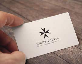
PLEASE FOLLOW OUR INSTRUCTIONS BEFORE YOU SUBMIT: Our company is Eight Points Capital LLC.
We want a talented graphic designer who can create an "old World" european look and feel for our logo. The logo is based on the historic Knights of Malta cross, which has eight points. It is important that this have an old world european "royalty" type look. Google Knights of Malta Cross and you will see lots of history. We need a company logo for a future website, as well as we also need a business card layout. Black and white is ok. Other than black and white, you may also use the red of the Knights of Malta flag if necessary.

For design, think old world european royalty crest. Royalty crest is the benchmark

Some ideas for you to draw inspiration from are included:

Recommended Skills

Employer Feedback

“very attentive”

Profile image Caballus, Australia.

Public Clarification Board

  • thedesignar
    thedesignar
    • 6 years ago

    Please check #163 & #164

    • 6 years ago
  • thedesignar
    thedesignar
    • 6 years ago

    Hello Sir, Please check my designs. And just tell me if you need any change on my designs.

    • 6 years ago
  • Caballus
    Contest Holder
    • 6 years ago

    Please review the instructions and artwork to see benchmark examples for "old world" look and fee (not modern)

    • 6 years ago
  • marcelaregoni
    marcelaregoni
    • 6 years ago

    How many colors we can use?

    • 6 years ago
    1. Caballus
      Contest Holder
      • 6 years ago

      preference is for the design to work and not rely on multiple colors 2 max. Please review the instructions and artwork to see benchmark examples for "old world" look and fee (not modern)

      • 6 years ago
  • NikeStudio
    NikeStudio
    • 6 years ago

    please check #89 #90 #91

    • 6 years ago
  • Caballus
    Contest Holder
    • 6 years ago

    This should have an "old World" royalty look and feel. It should not have modern fonts

    • 6 years ago
  • bmely
    bmely
    • 6 years ago

    please check

    • 6 years ago
  • djamalidin
    djamalidin
    • 6 years ago

    please check#31

    • 6 years ago
  • JIzone
    JIzone
    • 6 years ago

    please check #26 #27 #28

    • 6 years ago
  • marcelaregoni
    marcelaregoni
    • 6 years ago

    Hi, do you are looking for a traditional crest or a heraldic design?

    • 6 years ago
    1. marcelaregoni
      marcelaregoni
      • 6 years ago

      do the company name stay in the crest or below?

      • 6 years ago
  • Caballus
    Contest Holder
    • 6 years ago

    Please do not ignore instructions regarding desired style, look and feel

    • 6 years ago
  • eibuibrahim
    eibuibrahim
    • 6 years ago

    check #1, #2, #3

    • 6 years ago

Show more comments

How to get started with contests

  • Post your contest

    Post Your Contest Quick and easy

  • Get tons of entries

    Get Tons of Entries From around the world

  • Award the best entry

    Award the best entry Download the files - Easy!

Post a Contest Now or Join us Today!