Refine company corporate design and create a professional CD guideline

  • Status: Closed
  • Prize: €200
  • Entries Received: 3
  • Winner: sumaiya505

Contest Brief

FIRST OF ALL: If you are not a professional designer or you don't know what a professional corporate design guideline is, don't apply for this. I will recognize and you're out at the end anyhow.

Task:
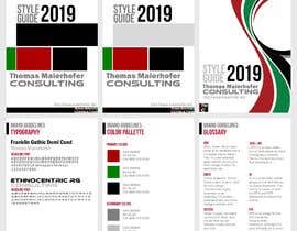
You should take the provided graphics and the existing homepage and make a professional CD guideline out of it. Refine the designs according to the drawings (color psychology, Styling, spacing, etc.) – if there are already good argue it; Document your changes; Make a CD -style guide out of it.
Homepage: http://www.maierhofer.de/

Acceptance criteria:
* Tools are Inkscape / Word / PowerPoint - no Adobe or Apple stuff.
* Files are clean, no auto generated crap
* Drawings must stay as SVG, Guildeline can be Word or Powerpoint
* Complete documentation and explanation of the changes you made (Example: I changed the secondary font to WHATEVER because its middle height is smaller and fits better to the primary font)
* CD guideline has the typical format used by agencies and the Industry - no fantasy or homebrew stuff.

Recommended Skills

Employer Feedback

“Very professional, she fulfilled the duties as stated in the contest. ”

Profile image ThomasMaierhofer, Germany.

Top entries from this contest

View More Entries

Public Clarification Board

  • StefanMoisac
    StefanMoisac
    • 5 years ago

    Meiner Meinung nach es lohnt sich nicht an diesen Logo zu arbeiten, es sind einfach zwei random (zufaellige) Schriftarten, die auf jeden Fall ueberbenutzt sind (Ethnocentric und wahrscheinlich Arial Black), mit schrekliche Farben. Wir wuerden gerne Ihren Logo neu designen mit Corporate Identity und Richtlinien. Wir arbeiten in CorelDraw und kann Ihnen alle ueblichen Datein-Formate liefern.

    Wir koennen Ihnen ueber das Chat (wenn sie das oeffnen und uns schreiben, wir als Freelancer koennen das nicht tun, sie mussen es erst tun) Beispiele senden, wenn sie leider keine Interesse haben, sie koennen uns einfach ignorieren, verzeihen sie uns. MfG, Stefan

    • 5 years ago
    1. ThomasMaierhofer
      Contest Holder
      • 5 years ago

      Es ist tatsächlich Ethnocentric. Über die Farben lässt es sich streiten, aber das Logo ist seit einigen Jahren in Benutzung und hat auch ein Konzept dahinter - Projekt Rot führt über roter Faden zu alle Punkte Grün. Das Logo ist nicht unproblematisch, da Punkte oft in Logos verwendet werden.

      • 5 years ago
    2. ThomasMaierhofer
      Contest Holder
      • 5 years ago

      Sie können gerne einen Vorschlag für ein neues Logo einstellen, auf der anderen Seite ist in der Industrie die Fähigkeit gefragt etwas aufzugreifen und zu verbessern, vielleicht sehen sie sich als Künstler, dann ist das natürlich nicht ihr Weg.

      • 5 years ago
  • sumaiya505
    sumaiya505
    • 5 years ago

    Were there supposed to be any document? as you said "completion of document..."
    will look forward to your response. Thanks in advance.

    • 5 years ago
    1. ThomasMaierhofer
      Contest Holder
      • 5 years ago

      An for shure the CD Guideline is a document

      • 5 years ago
    2. sumaiya505
      sumaiya505
      • 5 years ago

      Please check entry1, can you also get back to me via chat? Will be very helpful. Thank you.

      • 5 years ago

Show more comments

How to get started with contests

  • Post your contest

    Post Your Contest Quick and easy

  • Get tons of entries

    Get Tons of Entries From around the world

  • Award the best entry

    Award the best entry Download the files - Easy!

Post a Contest Now or Join us Today!