logo design: Boative

  • Status: Closed
  • Prize: $260
  • Entries Received: 240
  • Winner: shawky911

Contest Brief

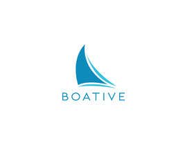
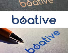
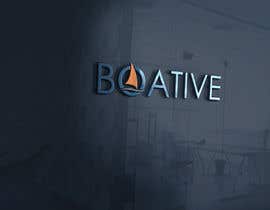
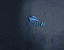
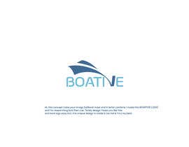
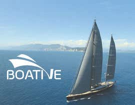
Boative is an online store for boat products and services. I am looking to create a visually appealing logo (modern and clean) with nautical colors with a subtle abstract nautical design.

My preferred thought was to have the "v" in boative be the abstract design where it, itself is a boat coming straight at the viewer. I would like to have the outriggers and towers of a sport fishing boat and/ or the mast of a sailboat come out of the top of the boat. This would be great if it could look like both types of boats.

(PDF files are attached with current logos, logo examples, and images with explanations for v abstract )

I am open to other concepts. font/ upper and lowercase choice is up to you! I am excited to see what you come up with!

For the selected design, I will need :
- adobe illustrator file
- eps
- pdf
- png
- jpeg
- need to know font names

Recommended Skills

Employer Feedback

“great, quick to respond, always willing to do extra”

Profile image ryan276, United States.

Top entries from this contest

View More Entries

Public Clarification Board

  • anubegum
    anubegum
    • 5 years ago

    Hello sir you can ask me any questions i will give you the Project please message

    • 5 years ago
  • abedassil
    abedassil
    • 5 years ago

    Please check #637 #636

    • 5 years ago
  • luisarmandojeda
    luisarmandojeda
    • 5 years ago

    Please check #604 #605 #606 #607

    • 5 years ago
  • NatachaH
    NatachaH
    • 5 years ago

    #601 #598

    • 5 years ago
  • alomhossain156
    alomhossain156
    • 5 years ago

    please check #535 #536 #543 #547

    • 5 years ago
  • Tamal28
    Tamal28
    • 5 years ago

    Please Check #575 #576

    • 5 years ago
  • sohelranar677
    sohelranar677
    • 5 years ago

    kindly check #566 #568 #570

    • 5 years ago
  • abedassil
    abedassil
    • 5 years ago

    Please Check #497 #496 #508

    • 5 years ago
  • Ripon8606
    Ripon8606
    • 5 years ago

    Please Check #556 #558 #559 #561

    • 5 years ago
  • Ripon8606
    Ripon8606
    • 5 years ago

    Please Check #555

    • 5 years ago
  • Gpixie
    Gpixie
    • 5 years ago

    #554

    • 5 years ago
  • alomhossain156
    alomhossain156
    • 5 years ago

    please check #535 #549

    • 5 years ago
  • paek27
    paek27
    • 5 years ago

    please check #539 , #544 .

    • 5 years ago
  • J2CreativeGroup
    J2CreativeGroup
    • 5 years ago

    Please, check #546 . Thanks!

    • 5 years ago
  • paek27
    paek27
    • 5 years ago

    please check #513 , #517 , #523 , #527 , #529 , #530 , #531 , #532 , #537 , #538 .

    • 5 years ago
  • ahmedakber
    ahmedakber
    • 5 years ago

    please check #528

    • 5 years ago
  • umairsunoo
    umairsunoo
    • 5 years ago

    Please check #478 . Thanks

    • 5 years ago
  • AR1069
    AR1069
    • 5 years ago

    Please check my entry #457 , #469, #462 , #465 and #471 . Thanks.....

    • 5 years ago
  • rajsagor59
    rajsagor59
    • 5 years ago

    Please check #420 thanks.

    • 5 years ago
  • rajsagor59
    rajsagor59
    • 5 years ago

    Please check #417 thanks.

    • 5 years ago
  • rajsagor59
    rajsagor59
    • 5 years ago

    Please check #412 ,#415 thanks.

    • 5 years ago
  • shahinurislam9
    shahinurislam9
    • 5 years ago

    please check #410 #411 , i hope like this design

    • 5 years ago
  • ryan276
    Contest Holder
    • 5 years ago

    Just wanted to throw out a big thank you to all of you. I truly want to apologize for not doing this properly. If you were rejected, I should not have done that. I should have rated you. Originally, I did that as a way to decide which logos fit what I was looking for. I should have just rated you. IF YOU WERE REJECTED, THAT DOESN'T MEAN YOU COULDNT RATE. In fact there were many 3 and some 4 star logos in there. I rated the remaining logos in which I did not reject yet

    ***I was treating this as a binary decision, and I am sorry because that was not fair to you because of the time you gave me. ***

    My apologies again and thank you!! You are all very talented!!!

    • 5 years ago
  • rajsagor59
    rajsagor59
    • 5 years ago

    Please check #404 ,405 thanks.

    • 5 years ago
  • rajsagor59
    rajsagor59
    • 5 years ago

    Please check #393 thanks.

    • 5 years ago
  • ryan276
    Contest Holder
    • 5 years ago

    Hi all,
    I truly appreciate all of your submissions thus far. Some of you have come up with some unique designs, in which I hadn't even thought of. There have been a few comments about rejections, and just note I am using that feature in order to separate the submissions into those that are further away from the logo of choice, and those that are best in line with what I am looking for and the ones I am deciding on.

    Some of these have been beautiful, but because boative is not a common name and I need my customers to easily read it, I have been going with designs with easy to read and modern fonts as well if as those with minimalist design abstracts.

    *** I mean no insult, and if you want feedback or explanation, please feel free to comment, and I will do my best to respond.

    I don't know if you can see each other's submissions, but those who are not rejected fit most what I am looking for.

    Much thanks,
    Ryan

    • 5 years ago
    1. pekavar
      pekavar
      • 5 years ago

      Dear CH,
      The V idea works only if you keep it minimal. Towers and masts are going to add too many details to the logo and that's not wise. I understand the name of your business might not be a common word, but it's still very intuitive on the industry you are related to. When the name itself says it all, you don't have the imperative need to give your customers clues on what the business is about.
      What I'm saying is, go minimal beyond your comfort zone. Keep it as simple as possible and add a strong tag line to support it.
      #266 by Maria (just as example) could work if treated the right way. Remember this, being amazed by the "creative way of placing icons inside words" is not a good sign. Turn to the industry leaders, compare their logos and you'll get my point.

      • 5 years ago
    2. masimpk
      masimpk
      • 5 years ago

      Please check #395

      • 5 years ago
  • J2CreativeGroup
    J2CreativeGroup
    • 5 years ago

    Hello! Please, check #384 . Thanks!

    • 5 years ago
  • shahinurislam9
    shahinurislam9
    • 5 years ago

    please check #367 #368 #369

    • 5 years ago
  • Ghaziart
    Ghaziart
    • 5 years ago

    #341 Thanks Regards syed !

    • 5 years ago
  • dumiluchitanca
    dumiluchitanca
    • 5 years ago

    please check #269 #270 #271

    • 5 years ago
  • steclere
    steclere
    • 5 years ago

    Hi Sir,if i cannot win just put me a star.

    • 5 years ago
  • pavelleonua
    pavelleonua
    • 5 years ago

    Any comments?

    • 5 years ago
    1. ryan276
      Contest Holder
      • 5 years ago

      Hi Pavlo,
      First off, thank you for your submission. Honestly, I want a fan of either font choices. You did follow my brief exactly on 130, and it was very minimal, which is what I was looking for, but after some other submissions, I found some other abstracts to more closely match my vision.

      • 5 years ago
    2. pavelleonua
      pavelleonua
      • 5 years ago

      Thank you for the clarification. take a look at #171

      • 5 years ago
  • giobanfi68
    giobanfi68
    • 5 years ago

    Hi Ryan, thank you so much for your answers. It is very important for us to improve our proposals.

    • 5 years ago
    1. ryan276
      Contest Holder
      • 5 years ago

      of course, I wish I did it sooner

      • 5 years ago
  • mariaphotogift
    mariaphotogift
    • 5 years ago

    Dear CH! It's not my style to question your decision but this time I would like to ask you at least explain why you reject even the entries that are following your brief? Me in particular spent 2 hours to design the boat and place it as it was requiered. I understand that it's your decision but please respect our work and effort at least with a rough explanation. Hope you get my point. Thank you and good luck!

    • 5 years ago
    1. ryan276
      Contest Holder
      • 5 years ago

      Thanks Maria! Just curious, do you get to see the other submissions or no? Not exactly sure what freelancer does or doesn't let you see

      • 5 years ago
    2. mariaphotogift
      mariaphotogift
      • 5 years ago

      Yes we can see each other's work.

      • 5 years ago
  • shahidulislam13
    shahidulislam13
    • 5 years ago

    CHECK #102 &103

    • 5 years ago
    1. ryan276
      Contest Holder
      • 5 years ago

      Hello,
      Thank you for your submission. My reasons for rejection was that I am not looking for an anchor theme due to it being more common in some of my competitors logos. Also, boative was spelled wrong.


      Best,
      Ryan

      • 5 years ago
  • Alinawannawork
    Alinawannawork
    • 5 years ago

    nice contest, will be glad to help :)

    • 5 years ago
    1. ryan276
      Contest Holder
      • 5 years ago

      Hi Alina,
      Thank you for your submission! I am glad that you were glad to help, and I am sorry that I didn't see this comment until now. It was very unique what you did with the t with making that into a vessel. I just was looking for more of a simple design! Much appreciated for your efforts!

      • 5 years ago
  • Alinawannawork
    Alinawannawork
    • 5 years ago

    lol canceled)

    • 5 years ago
    1. giobanfi68
      giobanfi68
      • 5 years ago

      like almost everyone. In this way we are not helped to improve our proposals. :-(

      • 5 years ago
    2. ryan276
      Contest Holder
      • 5 years ago

      Hi Giovanni, I had looked at your submissions, which were very artistic and different fonts. My Maine reasons for rejection was that i felt the fonts were a little too extravagant and harder to read. Boative isn't a common name, and I need my customers to be able to easily read it. Thank you for your submission!

      • 5 years ago

Show more comments

How to get started with contests

  • Post your contest

    Post Your Contest Quick and easy

  • Get tons of entries

    Get Tons of Entries From around the world

  • Award the best entry

    Award the best entry Download the files - Easy!

Post a Contest Now or Join us Today!