Design a Logo

  • Status: Closed
  • Prize: $200
  • Entries Received: 4
  • Winner: makspaint

Contest Brief

Hello,

We are a 1 year old company looking to rename and rebrand to break away from identifying with our parent company. We have come up with the name, now we just need a logo.

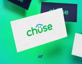
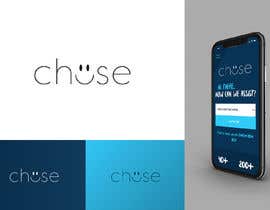
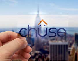
The new company name is either going to be: chüse

The idea of the word is a play on choose, because we are the only company of its kind that offers our clients the voice of over 40 builders, over 400 house designs in over 150 land estates, with the choice of over 20 lenders. So we offer a lot of choice and want people to chüse us.

Our current website is quite awesome (in our opinion) with bright colours, multiple 3D images and funky fonts. So it may be worth checking that out to ensure that any proposed logos don't clash with that.

Our website is: https://www.progressassist.com.au

We are not tied to the dark blue used in the website and in fact we may move away from that to better disassociate ourselves with our parent company.

As for direction on what I am hoping for, these are a few ideas I would like to see incorporated:

- A bright, clean and uncluttered logo
- Use the dots above the U to emulate a smiley
- Potentially 3D

I have attached an example of a ü that appealed to me when searching online. I like the brightness and life it has. It makes you smile looking at it.

There is the potential for this business model to go national (in Australia), so ultimately we want something that will pop on a grand scale.

Once the logo design has been finalised, we will require vector files and scalable versions for print and web mediums.

For any questions or to submit your work, please email travis@progressassist.com.au

Our registered email address will go to a different division (we will still get it however).

I am excited to see what you come up with.

Regards,

Travis Fancourt

Recommended Skills

Employer Feedback

“Maksim produced an original logo (not copied from others) that hit the mark with what we wanted. He also provided multiple file versions and options after being awarded the contest. Well done Maksim. ”

Profile image ProgressDevelop, Australia.

Top entries from this contest

View More Entries

Public Clarification Board

  • mariaphotogift
    mariaphotogift
    • 5 years ago

    WTF is going on here on freelancer? This is the exact copy of #252 be fair contest holder!

    • 5 years ago
    1. ArtStudio5
      ArtStudio5
      • 5 years ago

      yeah he copied my design

      • 5 years ago
  • Graphicbd35
    Graphicbd35
    • 5 years ago

    #661

    • 5 years ago
  • ranaislam50000
    ranaislam50000
    • 5 years ago

    please check #656#655

    • 5 years ago
  • sufiasiraj
    sufiasiraj
    • 5 years ago

    please check #649 #650

    • 5 years ago
  • ProgressDevelop
    Contest Holder
    • 5 years ago

    Hello All. Please no more entries. We have finalised it down to the top few. It is now Friday afternoon here in Australia, so I am leaving work for the weekend. We will award the winner on Monday. Thanks.

    • 5 years ago
    1. hellodesign074
      hellodesign074
      • 5 years ago

      Please check my entries

      • 5 years ago
    2. artsign
      artsign
      • 5 years ago

      My last entries #618, #619...have a nice time sir

      • 5 years ago
  • ArtStudio5
    ArtStudio5
    • 5 years ago

    every single one of them copied my original design thats not fair i spend a lot of hard work on the logo please be fair.Thanks

    • 5 years ago
  • Mojahid2
    Mojahid2
    • 5 years ago

    #565

    • 5 years ago
  • StefanMoisac
    StefanMoisac
    • 5 years ago

    the roof meme lives

    • 5 years ago
  • snehalakashsoni
    snehalakashsoni
    • 5 years ago

    PLEASE CHECK #535

    • 5 years ago
  • Rejaulkarim536
    Rejaulkarim536
    • 5 years ago

    Please check #504

    • 5 years ago
  • ProgressDevelop
    Contest Holder
    • 5 years ago

    Hi all, we have decided on chüse with one ü. Thanks to everyone who showed us options, it helped us make the decision to go with one ü.

    • 5 years ago
  • ProgressDevelop
    Contest Holder
    • 5 years ago

    Wow everyone. Just woke up to see some great logos. Well done. I will have a look through them all today and make a shortlist.

    • 5 years ago
    1. dileny
      dileny
      • 5 years ago

      Dear CH, you request sustained low letters, however the logos with 4 stars have typography in ALTAS, should I go in that direction? finally the name will be chüse or chüüse? thank you very much

      • 5 years ago
  • ibrahimessam56
    ibrahimessam56
    • 5 years ago

    Please check #432 #433 #434 #435

    • 5 years ago
  • alalkhanfl93
    alalkhanfl93
    • 5 years ago

    Hi There, Please check my design #423 Thank you

    • 5 years ago
  • sharifulislam66
    sharifulislam66
    • 5 years ago

    Please check#408#408#406

    • 5 years ago
  • ibrahim2025
    ibrahim2025
    • 5 years ago

    Please check #411. I hope you will like it. Thanks

    • 5 years ago
  • ProgressDevelop
    Contest Holder
    • 5 years ago

    Hello all: after seeing a number of entries, I am thinking about the name being chüüse with two u's. Maybe this will help with the creativity. Please feel free to submit options for this. I have amended those notes in the contest description.

    • 5 years ago
    1. faisalaszhari87
      faisalaszhari87
      • 5 years ago

      Nice Though Sir

      • 5 years ago
    2. dileny
      dileny
      • 5 years ago

      Please check ##391

      • 5 years ago
  • designerasad2723
    designerasad2723
    • 5 years ago

    #388 please give feedback

    • 5 years ago
  • eibuibrahim
    eibuibrahim
    • 5 years ago

    please check #373

    • 5 years ago
  • Mega Designers
    Mega Designers
    • 5 years ago

    Please check #370 and award if is possible...

    • 5 years ago
  • tieuhoangthanh
    tieuhoangthanh
    • 5 years ago

    Hi, Please check #368. Thanks !

    • 5 years ago
  • Rejaulkarim536
    Rejaulkarim536
    • 5 years ago

    Please check entry #353#352#361

    • 5 years ago
  • Rejaulkarim536
    Rejaulkarim536
    • 5 years ago

    Please check entry #353#352

    • 5 years ago
  • NemanjaStupar
    NemanjaStupar
    • 5 years ago

    Dear Contest Holder,

    Please check entry #341 , includes simple and memorable logo, color and font as a part of identity.
    Contact me regarding any additional informations and suggestions regarding the design.
    I'm looking forward to your feedback.

    Best Regards
    Your Stupar Designs

    • 5 years ago
  • graphicbooss
    graphicbooss
    • 5 years ago

    please check and feedback

    • 5 years ago
  • Hendnabil1
    Hendnabil1
    • 5 years ago

    please check #332 & #334

    • 5 years ago
  • sandy4990
    sandy4990
    • 5 years ago

    please check #297

    • 5 years ago
  • sandy4990
    sandy4990
    • 5 years ago

    please check #284

    • 5 years ago
  • nusratsamia
    nusratsamia
    • 5 years ago

    check my new entry #249

    • 5 years ago
  • nusratsamia
    nusratsamia
    • 5 years ago

    please check my entry #243

    • 5 years ago
  • ProgressDevelop
    Contest Holder
    • 5 years ago

    I am going off line now. Please read my notes below for inspiration. Thanks everyone!

    • 5 years ago
    1. faisalaszhari87
      faisalaszhari87
      • 5 years ago

      Take care sir

      • 5 years ago
    2. artsign
      artsign
      • 5 years ago

      have a look sir #231...thanks

      • 5 years ago
  • ProgressDevelop
    Contest Holder
    • 5 years ago

    Please think about this as you design: U chüse ! Meaning: "You Choose" Choose what? Choose your home, choose your builder, choose your location, choose your lender.

    • 5 years ago
    1. faisalaszhari87
      faisalaszhari87
      • 5 years ago

      Ok Sir

      • 5 years ago
  • nusratsamia
    nusratsamia
    • 5 years ago

    check my new entry #197

    • 5 years ago
  • ProgressDevelop
    Contest Holder
    • 5 years ago

    Please also feel free to show how the letter U could be used by itself (in addition to showing the full logo). I feel the U will play an important part of our marketing. Eg: "U" chüse (interpreted - You choose)

    • 5 years ago
  • tieuhoangthanh
    tieuhoangthanh
    • 5 years ago

    Hi, Please check #196. Thank a lot !

    • 5 years ago
  • kazisydulislambd
    kazisydulislambd
    • 5 years ago

    Please check my entry #110 #112 #114 #115 #116 #118

    • 5 years ago
    1. ProgressDevelop
      Contest Holder
      • 5 years ago

      Its good, I'm not sure if I like 3 dashes as the E though. Would be great to see our service incorporated into the logo: providing a large choice of homes to home buyers.

      • 5 years ago
  • mutlutekin
    mutlutekin
    • 5 years ago

    Please check #127 #130

    • 5 years ago
    1. ProgressDevelop
      Contest Holder
      • 5 years ago

      Creative, but it doesn't feel "corporate" enough. I like that you have tried to represent what we do but its not quite right. I appreciate you trying. Thanks.

      • 5 years ago
  • kazisydulislambd
    kazisydulislambd
    • 5 years ago

    Please check my entry #160 #162

    • 5 years ago
    1. ProgressDevelop
      Contest Holder
      • 5 years ago

      Thanks but it does not represent our service: providing home buyers with a huge amount of choice.

      • 5 years ago

Show more comments

How to get started with contests

  • Post your contest

    Post Your Contest Quick and easy

  • Get tons of entries

    Get Tons of Entries From around the world

  • Award the best entry

    Award the best entry Download the files - Easy!

Post a Contest Now or Join us Today!